Designing an online art exhibition: the two-rooms idea
Most artist websites treat paintings like products in a shop: a grid of thumbnails, a click, a lightbox. For North by North West, I wanted the opposite — a website that feels like walking into a gallery.
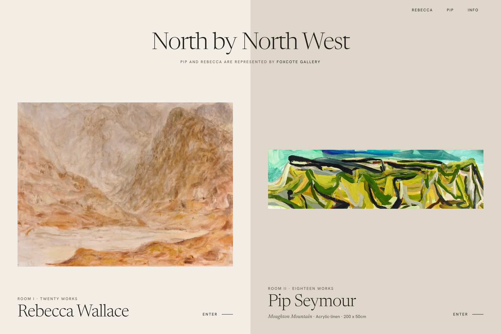
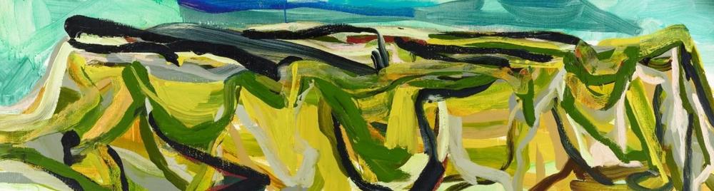
North by North West is an online exhibition for two painters, Rebecca Wallace and Pip Seymour. The brief was clear from the start: show their work as an exhibition, not as a gallery of images, and let every painting have the screen to itself.
That sounds simple. It turns out to be one of the more interesting design problems you can have, because almost every default on the web works against it.
The problem with grids
A grid is efficient. You can see twenty works at once, scan them quickly and move on. That’s exactly the problem. Paintings aren’t meant to be scanned. In a real gallery, nobody walks past twenty canvases in two seconds.
A grid also flattens everything. A large landscape and a small study end up as the same little square, side by side, competing for attention. The artist spent weeks on scale and composition, and the website undoes it with one line of CSS.
The idea: two rooms
The breakthrough was to stop thinking about pages and start thinking about rooms.
Two artists, two rooms. Room I holds Rebecca Wallace’s twenty works. Room II holds Pip Seymour’s eighteen. When you arrive, you’re at the entrance and you choose where to go — just like you would in a physical show.
That one decision shaped everything else. Each room got its own wall colour, so you always know where you are. Each artist got their own space, so neither is ever squeezed next to the other. And the visitor isn’t scrolling a list; they’re visiting a room.
Visitors don’t scroll a list. They choose a room, step in, and walk through the work.
Letting each painting fill the screen
Inside a room, every work opens fullscreen. No sidebars, no clutter, nothing competing with the painting. The interface stays quiet: the title, the medium and the size, and a small counter that tells you where you are in the room.
That counter matters more than it looks. In a gallery, you can always see how much of the room is left. Online, without it, people get lost or give up early.
Moving like you would in a gallery
I wanted moving between works to feel natural on any device, so the exhibition supports three ways to navigate:
- Swipe on a phone or tablet, the way you’d flick through photos.
- Keyboard arrows on a laptop, for people who like to sit back and browse.
- Buttons for everyone else, clear and always in the same place.
None of them is the “right” way. The point is that nobody has to learn how the website works before they can enjoy the art.
Motion that stays out of the way
The site uses GSAP and ScrollTrigger for its scroll-driven animation, and the hardest part was holding back. It’s very tempting to make paintings fly in, rotate and zoom. It’s also the fastest way to make the website more interesting than the art.
So the motion does only two jobs: it guides you from one space to the next, and it gives each work a calm moment to arrive. Nothing bounces. Nothing performs.
Thirty-eight large images, one fast page
Thirty-eight high-resolution paintings on a single page is a recipe for a slow website. The answer was lazy loading: each work only loads when you’re about to see it. The first screen stays light, and the rest follows as you move through the rooms.
It’s not glamorous work, but it’s the difference between an exhibition people visit and one they close before it loads.
What artists can take from this
You don’t need an exhibition concept to show your work better. A few principles go a long way:
- Give each work room to breathe. One painting at a time beats twenty at once.
- Never let the website crop or stretch your work. Show the original proportions.
- Always tell visitors where they are and how much is left.
- Let the interface step back. If people remember your buttons, something’s wrong.
You can see how the project came together in the full North by North West case study.